Projects
Studio Branding DCODE
Contract DCODE
Link to Contract DCODE
For DCODE I made a contract for the group. I put some basic rules in it like: we have to be at school on Monday, Wednesday and Thursday from at least 9 AM until 3 AM. I think making a contract is important to keep the group together and to make sure everyone is on the same page.
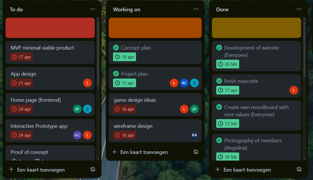
Trello DCODE
What did we do?
We used Trello to keep track of our tasks and what we had to do.
Why did we do that?
We did this because we wanted to keep track of our tasks and what we had to do. I put in the things I wanted to do and put a deadline for it so I know when I want to finish it.
How did we do it?
We made a Trello board and we put all our tasks on it. We also put the deadlines on it and we put the people who had to do it on it.
What were the results?
The results are that we kept track of our tasks and what we had to do. We also kept track of the deadlines and who had to do it. To be honest we only did this for creating the studio because we kept postponing our deadlines since we didn't finish our work on time. As a group we prefer to communicate about stuff and not look at a deadline because this can give stress and we prefer to work in this way.
What did I learn and how will it help us in the next steps?
I learned that it's important to keep track of your tasks and what you have to do. I also learned that it's important to keep track of the deadlines and who has to do it. Even though Trello doesn't work for me, it's nice to put in what you still have to do. This will help me in the next steps because I now know how to keep track of my tasks and what I have to do.
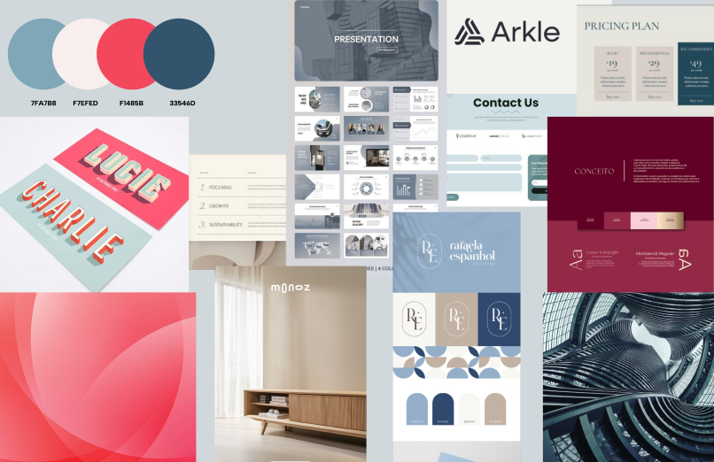
Moodboard DCODE
What did I do?
I made a moodboard for our studio to choose what type of style we wanted to use. It's a collection of pictures that represent the style I wanted to use for our studio.
Why did I do that?
I made this moodboard to find out what kind of style we wanted to choose for our studio. I wanted it to be more like a calm, relaxing and professional style.
Creating a moodboard is an important step in the process of designing an interactive media product, because it helps collect and analyze visual inspiration. My group and I wanted to make an website for our studio so I made a visual design of how I wanted it to look like. This interactive discussion and decision-making process is similar to user-centered design: you discuss, respond, and adapt. I searched for images that were calm, relaxing, and had a clean, professional look.
How did I do it?
To create the moodboard I wanted, I started by thinking about the style I wanted it to be and the feeling it gives you. I choose for calm, relaxing and professional. When I decided about the style I searched images on Pinterest and Google that matched this idea. I focused on soft colors, minimalistic designs and clean layouts. I looked for pictures that gave me a peaceful and calm feeling and used it for my moodboard. I added the pictures that for me gave that feeling and added it to my moodboard to create a clear visual direction.
What were the results?
We had 5 different moodboards since there are 5 people in our group. We all made a moodboard in our preferred style. We looked at all the moodboards and choose the syle we liked the most and made another moodboard out of this.
Making the moodboard is part of learning outcome 1 because it helps with the first step of designing an interactive media product. The moodboard was interactive because we worked together as a group, looked at each other’s moodboards, and gave feedback to choose one style. We also used digital tools to find and show our visual ideas. The style we chose will be used later in the design of an interactive product like a website or app, where users will see a calm and professional look.
What did I learn and how will it help us in the next steps?
I learned that creating a moodboard is a great way to start the design process. It helps to visualize ideas and gives a clear direction for the design. I also learned that working together as a group and giving feedback is important to create a final product that everyone is happy with. This will help us in the next steps of the project because we now have a clear style to follow when designing our studio.
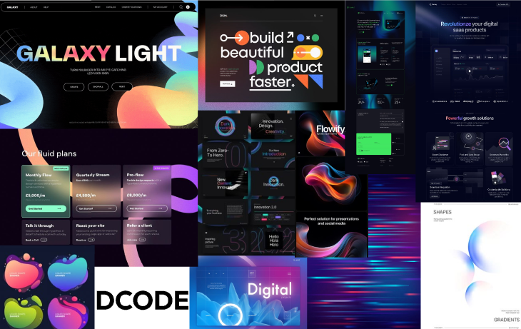
Final moodboard DCODE
What did we do?
Together as a group, we created the final moodboard for our studio. This moodboard represents the visual identity and overall style we all agreed on after comparing our individual ideas and preferences.
Why did we do that?
We made this final moodboard to make sure we all had the same vision for the studio’s look and feel. By combining the best elements from each of our individual moodboards, we created one clear and consistent style. This helps guide our future design decisions and keeps everyone on the same page.
How did I do it?
To help create the final moodboard, I first looked back at all the individual moodboards we made earlier. I used these to get inspiration and understand which elements worked well. Since we are a development studio, we wanted the final moodboard to reflect a more tech-focused style—modern, clean, and innovative. After that, I searched for new images on Pinterest that matched this tech aesthetic. I focused on visuals that had a modern and digital look, and selected the ones that best represented the feeling we were going for. I added these to the moodboard to help shape the final version.
What were the results?
The result is our final group moodboard. It clearly shows the style we want for our studio: modern, tech-inspired, and professional. It reflects who we are as a team and sets the tone for how our website and other visual designs will look like, and that we are more focused on the development part of media design.
The final moodboard is part of learning outcome 1 because it shows how we conceptualized and designed our studio’s identity. It is interactive because we all contributed to it, shared our ideas, and worked together to create a cohesive design. The moodboard will guide us in the next steps of designing our website and other media products, ensuring that we maintain a consistent style throughout our work.
What did I learn and how will it help us in the next steps?
I learned that collaboration is key when creating a cohesive design. By combining our individual ideas, we were able to create a stronger final product. This experience taught me the importance of communication and feedback in the design process. In the next steps, this will help us stay aligned and focused on our shared vision as we move forward with the project.
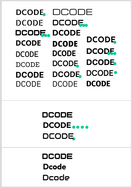
Font research/Typography DCODE
What did we do?
We researched a variety of fonts to find out which one would fit the style of the moodboard we made. Our goal was to choose a font that would fit with the calm, professional and tech-inspired style we created for our studio.
Why did we do that?
We chose to look at different fonts because the typography is a very important role in setting a tone and feeling of our studio's identity. We really wanted a font that would fit our easthetic we created in our moodboard. A good font can strengthen the overall design.
How did I do it?
I scrolled through the fonts in Figma to find fonts that looked good and fit the style of tech/development. I looked for fonts that were clean and professional. I also looked for fonts that were easy to read and not too fancy. Everyone in the group did this and after we all voted on the best font.
What were the results?
After we voted on the font we liked best, we all agreed that was going to be the font of our studio. It's a clear and professioan font so we didn't really need a second font.
Font research is part of learning outcome 1 because it is an important step in the design process. It helps us choose a font that fits our studio's identity and the style we want to achieve. The process was interactive because we all contributed our ideas and preferences, and worked together to find a font that everyone liked. This will help us maintain a consistent look and feel in our designs, making sure everything aligns with our studio's vision.
What did I learn and how will it help us in the next steps?
I learned that typography is a very important part of design. It can really change the look and feel of a design. I also learned that working together as a group and giving feedback is important to create a final product that everyone is happy with. This will help us in the next steps of the project because we now have a clear font to follow when designing our studio.
Logo designs DCODE
What did I do?
I created several logo designs for our studio. I tried out different ideas and styles to see what would work best. This helped us explore what kind of look and feel fits our brand.
Why did I do that?
I did this because our studio needed a logo. We wanted something that shows who we are and what we do. A good logo helps people recognize our brand.
How did I do it?
I looked for fun and simple logo ideas on Pinterest to get inspiration. After finding some ideas I liked, I used Adobe Illustrator to create my own logo designs.

During our second studio presentation, we didn’t use a logo yet. The coaches said they really liked the image we showed at the start of our presentation and suggested it could work well as a logo. So, I decided to start over and create new logo designs in Illustrator based on that image.
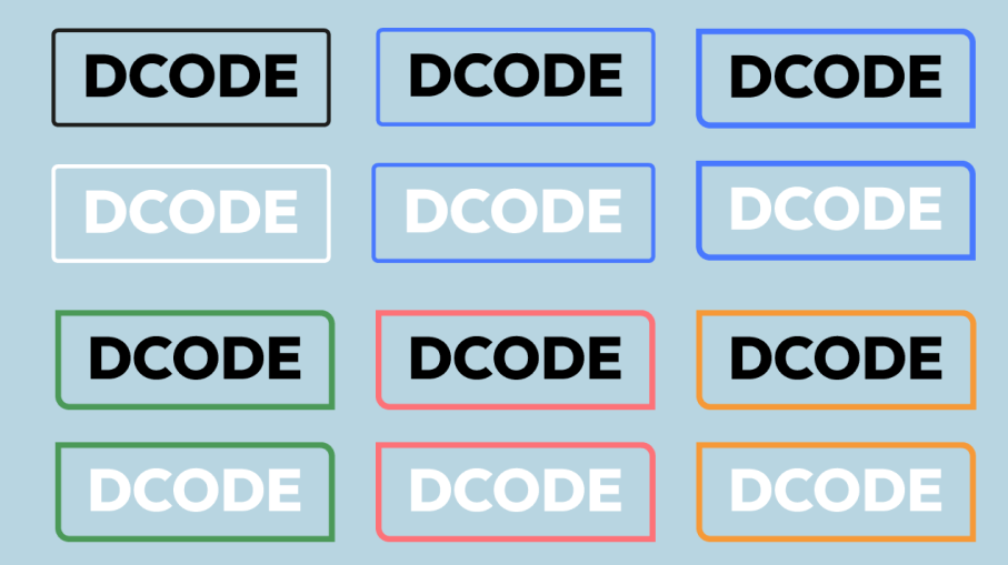
What were the results?
The final result is the logo we are using now. I didn’t make this version — someone else in our group designed it. I think it matches our style very well and represents our studio in a good way.
Slogan DCODE
What did I do?
I turned our slogan into a small animation to tell more about our studio. I made it so it works good with our style.
Why did I do that?
Me and my group had trouble choosing between the words "Create," "develop," and "Design" for our slogan, because each one represents a very important part of what we do. So insead of choosing just one, I made a small and subtle animation with all three words. This way, the animation highlights the full range of our work while keeping the message dynamic and engaging.
How did I do it?
I started by watching a few youTube tutorials on how to learn the basics of Adobe After Effects since I had no clue how to use that. I wanted to learn simple text animations. After getting a general idea, I experimented with the tools myself and managed to animate the slogan. Later, Louis suggested that I could add our colors to the three words to mach our logo. I figured out how to apply this to only the switching words and updated the animation.
What were the results?
The result is the animated video on top of this text. It brings our slogan to life in a way that matches the overall style of the project. I am proud of how it turned out, especially since it was my first time working with Adobe After Effects. the slogan is part of learning outcome 1 because it is an important part of our studio's identity. It helps us communicate what we do and what we stand for. The animation is interactive because it adds a dynamic element to our design, making it more engaging for the audience. This will help us create a strong visual identity for our studio and make our work more memorable.
What did I learn and how will it help us in the next steps?
I learned the basics of Adobe After Effects, including how to animate text and apply custom colors or a gradient. The experience gave me more confidence in using animation tools. In further steps I will be able to create more advanced animation to make our designs more dynamic and engaging.
Brand guide DCODE
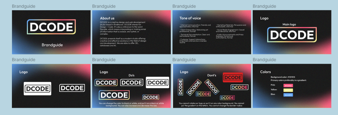
What did I do?
I made a brand guide for our studio. It includes the colors, fonts, and logo we are going to use for our studio.
Why did I do that?
I did this to make sure we all use the same colors, fonts, and logo for our studio. This way we have a clear style and it looks more professional.
How did I do it?
I looked on the internet what's supposed to be in a good brandguide and I made a list for that. Me and Angelina decided to make the brandguide so we split the work. I made the front page, about us tone of voice, do's and don'ts for the logo and the color pallette.
What were the results?
The result is the brand guide you see above. I think it looks really good and it fits our style. I am really proud of it.
The brand guide is part of learning outcome 1 because it helps us create a consistent visual identity for our studio. It is interactive because we all contributed to it and worked together to create a clear style. This will help us maintain a cohesive look and feel in our designs, making sure everything aligns with our studio's vision.
What did I learn and how will it help us in the next steps?
I learned that creating a brand guide is an important step in the design process. It helps to visualize ideas and gives a clear direction for the design. I also learned that working together as a group and giving feedback is important to create a final product that everyone is happy with. This will help us in the next steps of the project because we now have a clear style to follow when designing our studio.
KLETS!
Brainstorming ideas project KLETS
What did I do?
I brainstormed with my group about what we wanted to do for our project.
Why did I do that?
We did this to align on what we wanted to accomplish with our project and how we would approach it. It was important to have a clear vision before moving forward.
How did I do it?
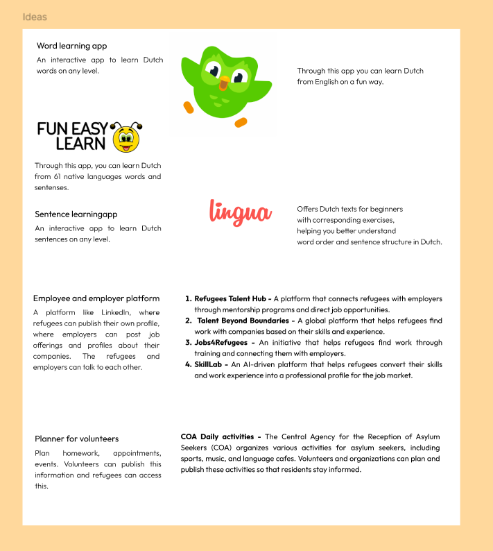
Research app for refugees
I researched ideas on Google to find meaningful ways to support refugees in the Netherlands. I added all the ideas I liked to our shared document in Figma. After we had a lot of ideas, we voted on the project concept we liked the most and discussed it with our stakeholder and did interviews with the refugees on location to find out if this was wat they wanted.
What were the results?
The result is the project we are workin on now, a web app that helps refugees learn Dutch and gain knowledge about the Dutch culture. I think it's a great way to support them, especially considering they only have one hour of Dutch lessons a week. The brainstorming process is part of learning outcome 1 because it involves conceptualizing and designing an interactive media product. It was interactive because we all contributed our ideas and worked together to find a project that everyone liked. This will help us create a more focused and effective project that meets the needs of the refugees we are working with.
What did I learn and how will it help us in the next steps?
I learned how important it is to start a project with strong teamwork and open communication. By researching and sharing ideas, and discussing them with bot the group and the stakeholder. I gained a better understanding of how to shape the project that meets real needs. This experience will help us stay focused and collaborate more effectively as we move forward with designing and developing the web app.
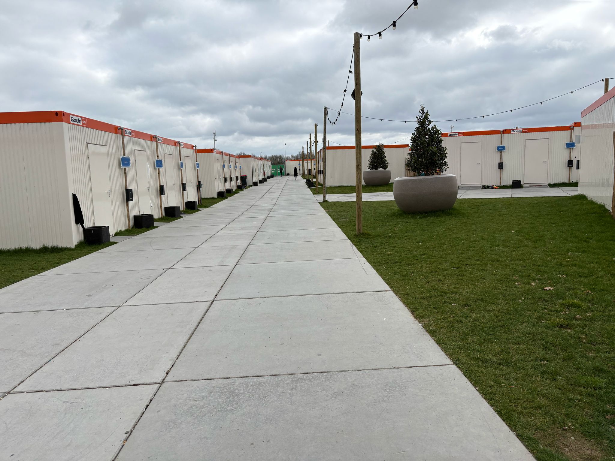
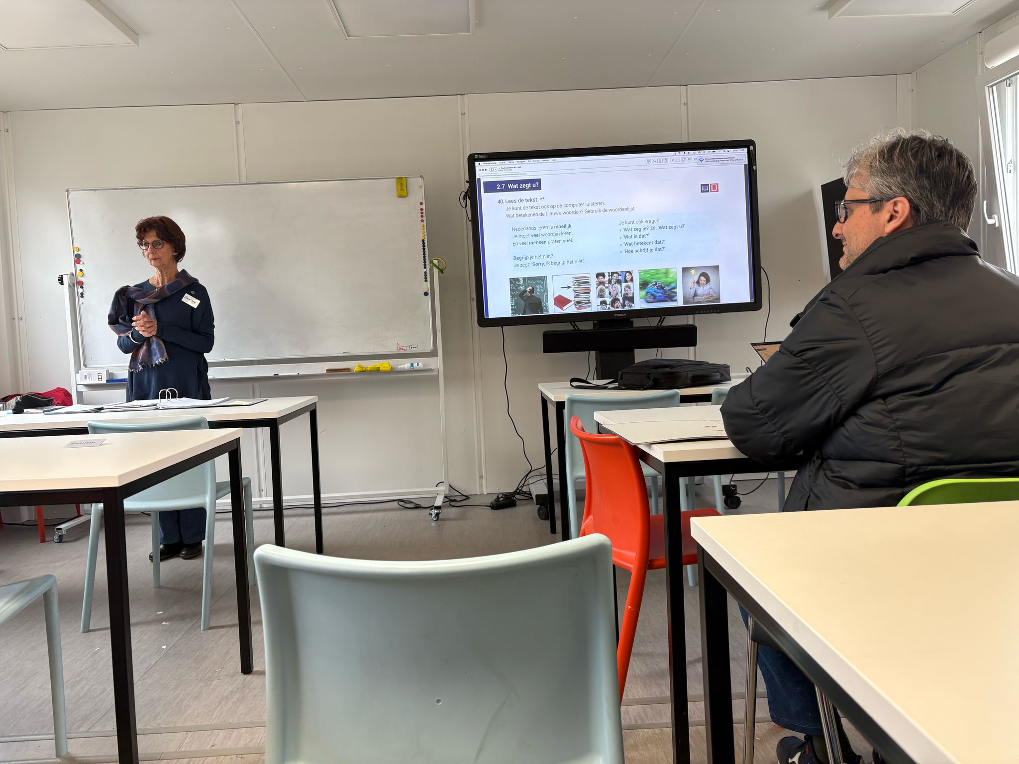
Visiting location and doing interviews
What did we do?
We visited the location of our project and we did interviews with the refugees and volunteers that were there. We wanted to find out what our design challenge was.
Why did we do that?
We wanted to know what the refugees need more to learn Dutch and to learn about the Dutch culture. We also wanted to know what the volunteers do and how they work. And we wanted to look at the location to get a better insight of the location and the refugees.
How did we do it?
We prepared an interview to do with both of them. I voice recorded it (with permission of course) so we can listen it back in case we missed something.
What were the results?
We had an interview with a person who didn't speak Dutch or English so it was pretty hard to communicate with them. I thought all of them would at least talk a little bit of English. Making a Dutch learning app now is much harder because we have to translate everything from their motherlanguage so every refugee can use the app. For English speaking people it's not that hard to make because we can speak English of course and we can communicate in English as well. But we want to include every refugee so we have to translate it from every language who is there at IMA. I think this is good we found this out early on in the project so we can work on it and find a solution for it. We also found out that the refugees really want to learn Dutch and they are really motivated to learn it. They also want to learn about the Dutch culture and how to live in the Netherlands. This is really good because we can use this for our project and we can make an app that helps them with this. We also found out what our design challenge is. We have to make an app that helps the refugees learn Dutch from their mother language in an easy way. They also want to learn about the Dutch culture and how to live in the Netherlands. We can use this information to make a good app for them.
What did I learn and how will it help us in the next steps?
I learned that it's important to visit the location and to do interviews with the people who are there. This gives you a better insight of what they need and what they want. This will help me in the next steps because I now know how to communicate with them and how to get the information we need for our project. They wanted a good app where they can learn Dutch from their mother language. We Want to implement that with AI because we don't speak their language and we can't translate everything from their language to Dutch. We want to use AI to translate it for us so we can make a good app for them.
Project plan
Link to Project Plan KLETS
What did I do?
I made a project plan for our project, KLETS.
Why did I do that?
To get a clear overview of what we are going to do for our project and how we are going to do it. It is important to have a clear plan before starting a project so you know what you are doing and what the goals are.
How did I do it?
I looked at what you are supposed to put into a project plan and I wrote down per section what applied for us.
What were the results?
The project Plan you see above. I added the problem, the solution, a little bit about our target audience, what our web app has to offer, and important functions you can find on our app.
What did I learn and how will it help us in the next steps?
I learned that it is important to have a clear plan before starting a project. It helps to visualize the goals and what you are going to do. I also learned that it is important to communicate with your group and get feedback on your work. This will help us in the next steps because we now have a clear plan to follow and we can use this as a reference for our project.
Logo design app KLETS!
What did I do?
I designed a logo for our app called KLETS! I wanted to create something that fits the style and feeling of the app. The logo had to be simple, recognizable, and match the fun and friendly tone we want for KLETS!
Why did I do that?
I created the logo because our app needed a strong and clear visual identity. A logo helps people recognize the app easily and shows what the app is about.
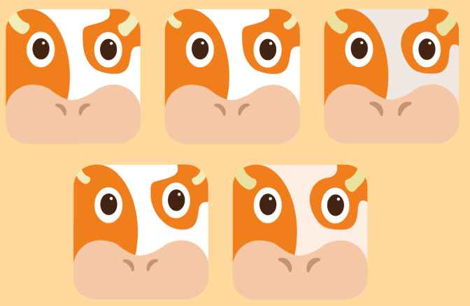
How did I do it?
Together we decided we wanted to make a logo with a sorth of animal, kind of like Duolingo has. A mascot type. We wanted something Dutch so someone in our group came up with a Cow. I thought this was a good idea since a cow is a typical Dutch animal. I made a logo design of a cow in Adobe Illustrator. I got the inspiration from DuoLingo, just a zoomed in head of a orange cow. I thought that would be pretty cool.
What were the results?
A cow similar to mine but just a little bit of a better design. The nose isn't that round and the horns are a little bigger and better. I think it looks really good and it fits our app design.
What did I learn and how will it help us in the next steps?
I learned that it's important to keep the design simple and not put too much detail in it since the design of our app will also be pretty simple. I think this will help me in the next steps because I now know how to make a good logo for our app.
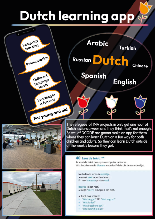
Poster Dutch Language App
What did I do?
I designed a poster for our project to visually explain our concept. I made sure the poster was clear, simple, and showed the most important information about what we want to create.
Why did I do that?
I created the poster to show what our project is about and how we plan to develop it. The goal was to make our idea easy to understand for others, like coaches and classmates. A good poster helps people quickly see the main idea and how we want to approach it.
How did I do it?
We had to make a poster that when people walk past it they immediately see what we are going to make. First I didn't really know how to do that so I put a lot of text on a file in Adobe Illustrator. I asked feedback on it.
The feedback was that it wasn't visual enough and far too much text. We went to the location of our so maybe I could use pictures I made of the location to make it more visual. and I had to make a visual design of the idea we had.
I thought this was a good Idea since I didn't really know how to make a good poster for it. I summarized the text more but kept the most important parts. I wanted to make it more Dutch looking because it would be a Ditch app, and I added the phone to make it more visual.
I made a new poster design keeping the feedback I got in mind to make it more visual. I still wanted to make the poster Dutch because it was going to be a Dutch learning app we were going to make. After I made this poster in Figma I asked feedback again.
The feedback was that the pictures I put in the poster weren't relevant to what we were making so I didn't have to put them in. The phone I had should be bigger because that's the main thing from our project. An app on the phone. The languages I put in could also be more visual with flags of the countries. And I had to put in way less text.
I found this feedback more useful then the previous feedback. I made the flags visual and I made the phone bigger because that's the central part of our project. I added a lay-out on the phone of how our app was going to look like so people had an idea about that. I put the 4 most important things about the app on the side so people don't have to ask about that, and I added all the text in a QR-code if you want to find out more about the app. I made it more colorful instead of black because that makes it more fun to look at and I kept the tulips in the background to make it more Dutch.
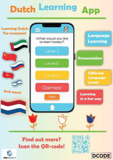
I again made a new poster. The final one. I deleted the pictures because I agreed that it wasn't relevant for an information poster about our app. The phone is in the central so it's clear that it'll be an app for on the phone. There were flags instead of the languages and I made clear you can learn Dutch from a lot of languages. I put the text we wanted to put on the poster in a QR-code so if people are interested they can scan it and read it themselves. I still kept the Dutch style by using tulips in the poster.
What were the results?
The result is the poster you can see above. I’m really proud of it. I think it looks great and clearly shows what we are trying to create. At first, I didn’t really know how to make a strong concept poster, so I just started with a basic version. After getting feedback, things became much clearer to me. That’s why I removed some parts and added new ones to improve the design.
What did I learn and how will it help us in the next steps?
I learned that feedback is very important when creating a good design. I also realized that keeping a poster simple, with not too much text, makes it easier to understand. This experience will help me in the next steps of the project, because now I know how to design a strong and clear concept poster.
App Design KLETS


What did I do?
I made the design for the level path of the app we are going to make for our project. I made a level pad for the app so the users can see how far they are in the app and how many levels they have to go.
Why did I do that?
I did this to help the users see how far they are in the app and how many levels they have to go. I thought it would be a good idea to make a level pad so the users can see their progress in the app. This way they can see how much they have learned and how far they are in the app.
How did I do it?
Someone of our group made the icons for the levels and I made the path in between it to make it more visual and to show that all the levels are connected. I made the level path in Figma and used the icons that were made by someone else in our group. I used the colors from our branding to make it fit our style.
I got some feedback that our level path looked too much like DuoLingo and I had to give my own twist to it. So I decided to make the circle Tulips to make it more Dutch. I made this Design in Adobe Illustrator, I kept the colors. When you finished a level I made sure the flower opened. previously you had a golden star
Before:

After:
What were the results?
A pathway through the levels of the app that shows the user how far they are in the app and how many levels they still have to go. The pathway is interactive because it shows the user their progress in the app. The design is part of learning outcome 1 because it helps us create a visual representation of the app and how it works. This will help us create a more engaging and user-friendly app that meets the needs of our target audience.
What did I learn and how will it help us in the next steps?
I learned how to make a level pad in Figma and Illustrator and how to use the colors from our branding. I also learned how to work together with someone else in the group to create a design that fits our style. This will help us in the next steps because we can use this level pad in our app and it will help the users see their progress in the app.
User stories

What did I do?
I made some user stories for our app KLETS!. I wrote down what the users want and need from the app based on the interviews we did with the refugees.
Why did I do that?
I did this to have a clear overview of what the users want and what we have to implement in the app. This is important because we want to make an app that the users will actually use and that will help them learn Dutch.
How did I do it?
I wrote down the user stories in a document. I used the information we got from the interviews we did with the refugees. I also looked at the research I did for the app ideas we had. I made a user story for every group member so we all had a clear overview of what we wanted to implement in the app.
What were the results?
The results were that we had a clear overview of what we wanted to implement and what everyone in our group could do to help make the app better. We also had a clear overview of what the users wanted and needed from the app. This will help us in the next steps because we now know what we have to implement in the app and what we have to do to make it better.
User testing
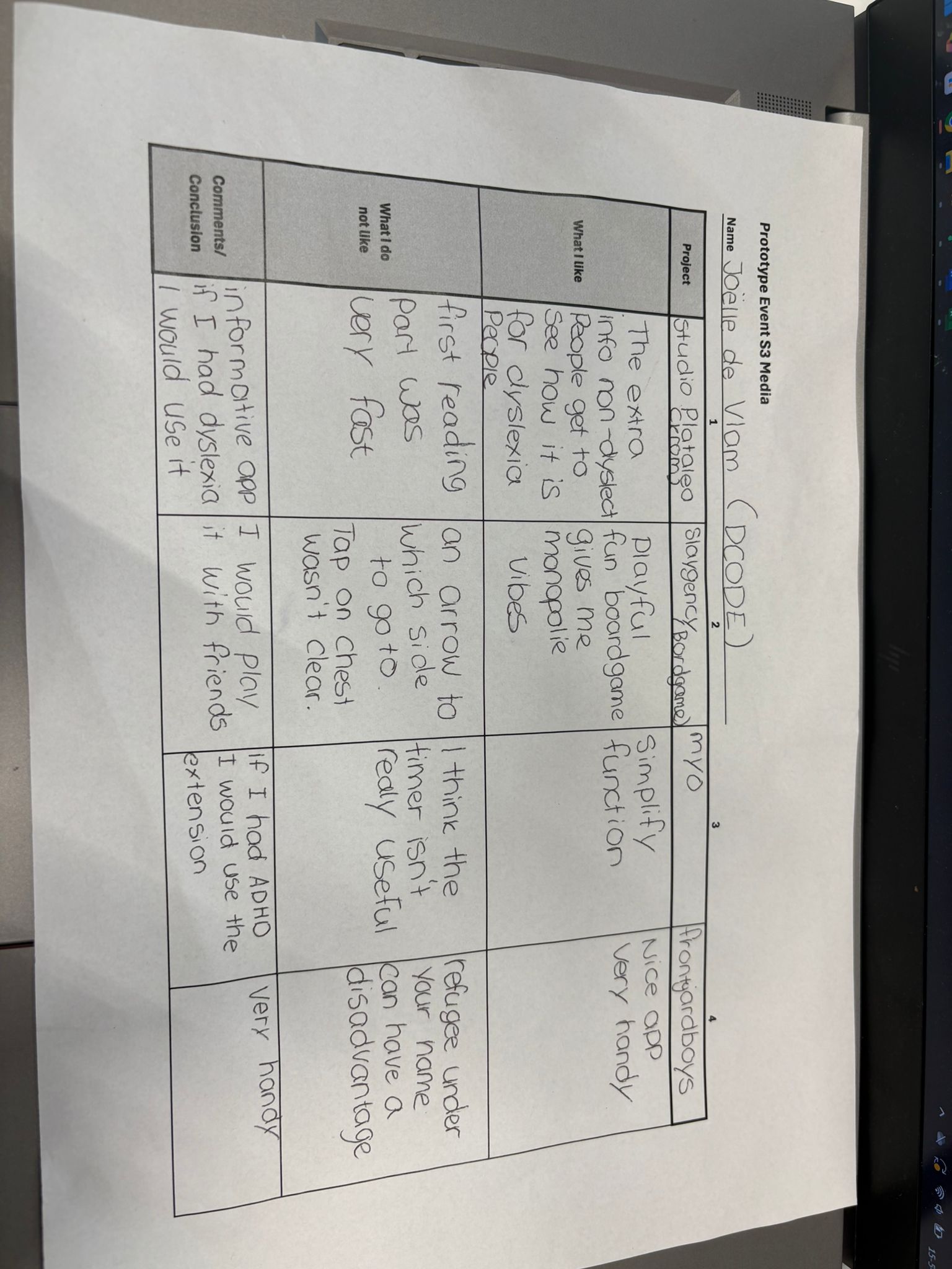
Link to Usability test
What did I do?
I made a user test for our Figma Prototype, I created the test and tested it with two users from our target audience since our whole group would do the same. The goal was to get feedback on the app's usability and design before coding it.
Why did I do that?
Testing the prototype before coding it is very important to find out if the app is user-friendly and if there are any problems at all. It helps to identify any issues or areas of improvement so we can meet the expectations of our users.
How did I do it?
I created a user test in Word with a list of specific tasks for the user to complete. During the test I observed the user to see if there were any problems of if they had any questions. I wrote everything down and at the end of the test I asked the user some questions about their experience with the app. I also asked them to give feedback on the design and usability of the app.
What were the results?
Overall, the feedback I got was positive, the user found the app easy to use and liked the design. They did have some suggestions for improvement. I documented all of it and shared it with my group so we can make the necessary changes before we start coding the app.
What did I learn and how will it help us in the next steps?
I found out that user testing is very important to improve the design and usability for the app. it helps to identify any issues or areas of improvement we didn't see before we started coding it. We use the feedback to make the necessary changes to our app before we start coding it. This will help us create a better app that meets the needs of our users and is more user-friendly.
Show case project
We had a showcase for our project. I thought it was really fun to show our project to other students and coaches and we got a lot of good feedback on our project which we can use to improve our project. I also went to different projects and gave them feedback. I thought it was really interesting to see what other students made and how they did it. I think this is a good way to learn from each other and to get feedback on your project. I also learned a lot from the other projects and I think this will help me in the future.
Stakeholder contact
We had contact with our stakeholder multiple times. The first time we did an interview to find out what she thought of our project ideas. I recorded it with her permission. I listened it back afterwards and wrote the most important things down. The second time we had contact with her we were on location. She gave us some tips on who we could interview which we did. I also recorded these conversations to listen them back and write the most important things down. And now every week we sent her our work and what we are doing now. I help my group with what we have to put in the mail, but I don't send it because we have one person who always sent the mails. I did sent an email to change the date of an online meeting we had planned because our stakeholder was sick.
For the rest she gave us some ideas which we can implement in the app like scanning QR-codes on for example a house, and if you scan it you can get the dutch translation of house. I thought this was a really good idea, only we don't want to put QR-codes around the location but I decided to make sort of a memory game out of it to make it more fun.
What did I learn and how will it help us in the next steps?
I learned that it's important to have contact with your stakeholder. This gives you a better insight of what they want and what they need. This will help me in the next steps because I now know how to communicate with them and how to get the information we need for our project.
Advice Report KLETS!
Link to Advice report
What did I do?
I made an advice report for our app KLETS! with a little help of Angelina. I wrote the report so it was clear how far we were with the project and what could still be added to the app and how long it would take to make it. I added what we already did what programs we used and a SWOT analysis. I also added our Figma and the list of languages we implemented in the app.
Why did I do that?
I did this to give an overview of our project and what we have done so far. I also wanted to show what we still have to do and how long it would take to make it. This is important for our stakeholder so she knows what we are doing and how far we are with the project.
How did I do it?
I wrote the report in Word and I added all the information we had so far. I also added the Figma link and the list of languages we implemented in the app. I made sure it was clear and easy to read.
What were the results?
The result is the advice report you see above. I think it looks really good and it shows our project really well. I am really proud of it.
What did I learn and how will it help us in the next steps?
I learned that it's important to give an overview of your project and what you have done so far. This gives you a better insight of what you did and how you got there. This will help me in the next steps because I now know how to give an overview of my project and what I have done so far.
Portfolio
Moodboard Portfolios
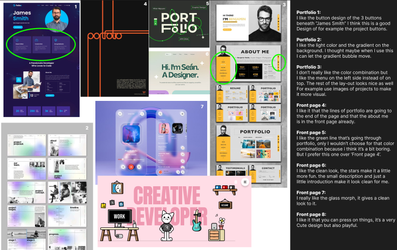
What did I do?
I created a moodboard with portfolio designs that I found inspiring or visually appealing.
Why did I do that?
I did this to help found out what visual style I wanted for my own portfolio. By collecting examples, I was able to find out what elements I liked and get a clearer sense of the look and feel I wanted to achieve.
How did I do it?
I searched for styles I liked on Dribbble and Pinterest, and put them together in a moodboard. I numbered each design and added notes about what I liked and disliked about them. This helped me better understand my own preferences and make more focused design choices for my portfolio.
What were the results?
The result is the moodboard I created with the notes, which helped guide the visual direction of my portfolio.
The moodboard is part of learning outcome 1 because it shows how I conceptualized and designed my portfolio. It is interactive because I actively engaged with the designs, analyzing what worked and what didn't. This process will help me create a more cohesive and visually appealing portfolio that reflects my style and skills.
What did I learn and how will it help us in the next steps?
I learned how to analyze design elements and understand my style. By creating a moodboard I was able to visualize my preferences and set a clear direction for my portfolio design. This will help me stay focused on maintaining a consistent style in the next steps and make informed decisions as I continue to refine and develop the portfolio.
Font research/Typography Portfolio
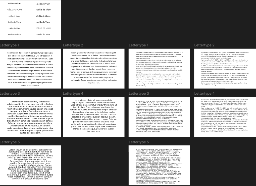
What did I do?
I did some font research for my portfolio to find out which typography style I liked the most. I looked at different fonts and compared them to see which one fits best with the look and feel I want.
Why did I do that?
I wanted to find a font that matched my style. A good font is important for a website because it really affects how the site looks and feels. I was looking for something that’s easy to read and also looks nice on my portfolio.
How did I do it?
I explored the fonts available in Figma. I wanted something simple, but not too common. That’s how I found the font Albert Sans — it felt clean, readable, and a bit different.
What were the results?
I chose Albert Sans as the font for my portfolio. I think it fits both my personal style and the overall look of my website. It's clean, simple, and easy to read. I also like that it's not a font you see everywhere, which makes my portfolio feel more unique.
What did I learn and how will it help us in the next steps?
I learned that typography plays a big role in design. The right font can really change the whole feeling of a project. I also learned how useful it is to work together and give feedback as a group. This experience will help us in the next steps of the project, because now we have a clear font to use as part of our studio’s visual identity.
GitHub

Link to GIT
What did I do?
Made a website with HTML, CSS and JavaScript. I used GitHub to keep track of my code and to make sure I didn't lose it.
Why did I do that?
I did this because I like coding and I wanted to make a website for my portfolio. I also wanted to learn how to use GitHub and version control.
How did I do it?
I made a repository in GitHub and I started coding in Visual Studio Cude. I used HTML, CSS and JavaScript to make the website. I used GitHub to keep track of my code and to make sure I didn't lose it. I also used GitHub to share my code with others.
What were the results?
The website I have now. It's not done yet of course because I just started. I want to make the design of the home page a lot better and I want to put all my work in the project page instead of the learning outcome page.
Code snippets
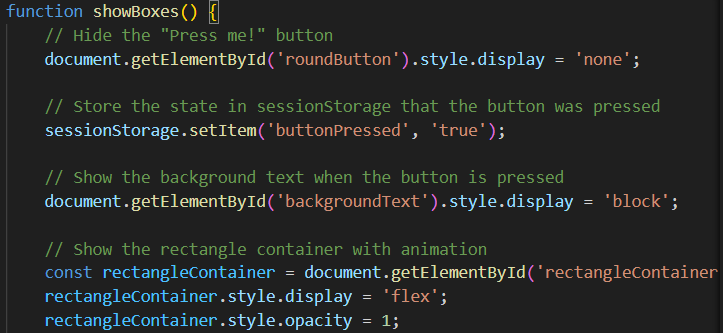
This is a code snippet of my website. I am starting to understand more about JavaScript but these explanations above the part of the code helps me a lot with understanding the code.
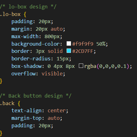
I also use the lines in my stylesheet to keep it clean instead of messy and it really helps me to keep my stylesheet much cleaner then when I started coding, so when I didn't use it yet.
What did I learn and how will it help us in the next steps?
I learned how to use GitHub and version control. I also learned how to code in HTML, CSS and JavaScript. This will help me in the next steps because I can use this knowledge to make my portfolio and other projects. I also learned how to keep my code clean and organized, which will help me in the future when I work on bigger projects.
ReadMe file

Link to ReadMe File
What did I do?
I made a ReadMe file for my GitHub repository. I added a description of the project, how to install it and how to use it.
Why did I do that?
I did this to make it easier for others to understand my project and how to use it. A ReadMe file is important because it gives an overview of the project and helps others understand what it is about.
How did I do it?
I wrote a description of the project, how to install it and how to use it. I also added some screenshots of the project to make it more visual.
What were the results?
The ReadMe file you see above. I think it looks good and it gives a clear overview of the project. I am really proud of it.
The ReadMe file is part of learning outcome 2 because it helps others understand my project and how to use it. It is interactive because it gives an overview of the project and helps others understand what it is about. This will help us create a more focused and effective project that meets the needs of the users we are working with.
What did I learn and how will it help us in the next steps?
I learned that a ReadMe file is important to give an overview of the project and help others understand what it is about. I also learned that it is important to communicate with your group and get feedback on your work. This will help us in the next steps because we can use this feedback to make changes in our project before we start coding it.
Transfer GitHub to GitLab
What did I do?
I transferred my GitHub repository to GitLab. I did this because Fontys uses GitLab instead of GitHub. I prefer to work on GitHub but I understand that Fontys uses GitLab so I transferred my repository to GitLab.
Why did I do that?
Fontys wants my Portfolio on GitLab which I understand.
How did I do it?
I asked ChatGPT how I had to do it because I actually had no clue. I followed the steps it gave me and it worked. Firstly I had to open the terminal and clone my GitHub repository link and then I had to make a repository in GitLab. I had to remove the GitHub remote in the terminal and add the GitLab remote with my repository. After I did this I had to push. I got an error because my GitLab repository already had a commit, it automatically made a ReadMe file. I did a force push since this file wasn't important and that's how I transferred my GitHub repository to GitLab.
What were the results?
The results are that my Repository is now on Gitlab, here is the GitLab repository: Link to GIT